 Skip to content
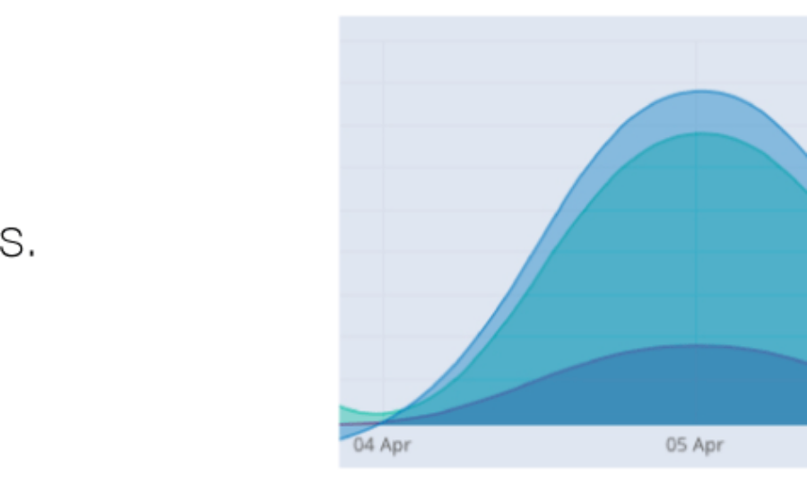
The new Nudge dashboard will roll out in the next release. It has been completely redesigned to be more aesthetically pleasing and easier to navigate. Most of the improvements are visual, looking at the data in a new way. Our graphs have been opened up to show the flow of data. At a glance we can compare how the data is performing. Improved location map that highlights where your content is most popular.  Drop downs let you drill down into each piece of content to get a better understanding of the performance.
  Our new interactive graphs give you a quick breakdown of important information like shares and engagement.
  Another version of our interactive graphs, giving you a quick indication of your biggest influencers.
  We are excited for the release of the new dashboard and are rolling out new versions all the time. It would be good to get you started on Nudge, email us to get started.
|
|---|