Skip to content
Luxury advertisers have been slow to adapt to new technologies and advertising methods.
For a long time, they’ve opted to stick with what they know; print placements in the ‘right’ magazines where they feel reassured by the company they keep with other brands, i.e. brand safe environments.
With growing pressure from millennials to adapt to digital channels, the shift towards adoption has started.
We’ve picked out a few examples of advertisers in the luxury space, doing native well.
Talk to a Nudge account manager about how we can help you be successful with native.
BVLGARI: A Nocturnal Perspective on New York City
Things we liked:
Overall the presentation is nice and simple, which works well in this space; it’s the right publisher, the content feels premium and it gives you a glance of the lifestyle they’re selling. The ‘Shop the Look’ is great – it let’s the product do the talking and links through to the product pages. However, links under each image would have been even better.
Overall it’s a great piece of content and feels like they’ve taken it out of a luxury magazine and put it online; a lifestyle piece done the right way, and the photos and products emphasizes that.
They’ve also left prices out, which makes sense for a luxury brand.
Downsides:
The photos are great as they act like a calendar of places they’re going. However, because they’re only featured in the slideshow at the top of the article, it’s likely that most people won’t be going back to look through them as they read the content, causing a slight disconnection. If they’d slotted the photos into the diaries, it would help tell the story and allow more people to see them.
Apart from including photo’s in the diaries, we’d liked to have seen links to the products, especially as you can’t copy paste the product names either.
Good share copy with a nice photo, but a little more text below the headline wouldn’t have hurt.
The article’s load time on desktop is a problem too, but it runs more quickly on mobile.
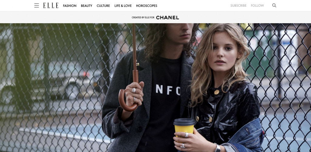
Chanel: Girl meets boy: Modern Menswear-Inspired Dressing
Things we liked:
Chanel’s campaign on Elle is appealing to a modern, younger individual and we really like what they’ve done with the content. The brand comes through well as they’ve used images to tell the story; it’s nicely stylized and allows the reader to experience the lifestyle through the different looks, as they read through the article.
We also liked that they’ve included product links throughout the content. It adds value to the brand as well as serving a bottom-funnel purpose, but also allows the reader to learn more about each product.
They’ve also done well with their social sharing, where they’ve included a nice headline + image, which would have gotten a lot of click-throughs.
Downsides:
When someone lands on the content for the first time, all they see is “Created by Elle for Chanel”, which instantly makes it feel like an ad. People aren’t seeing what they expected to arrive on and by showing the headline, it reassures them of this. We would move the headline above the photo for the purpose of context.
Another thing we noticed is that the article has a slow load time, meaning their budget could be bleeding out. This is something we see far too often and it’s a big waste, not just from a budget perspective, but also for the UX point of view.
A small thing we picked up on was that dates and the number of shares are visible – a luxury piece shouldn’t show that, it should elevate above the rest.
Finally, the piece should have included a ‘Shop the Look’, but as the product is in the front of every photo, it makes it less bad.
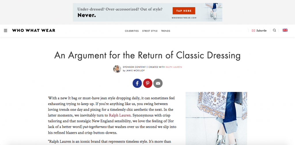
Ralph Lauren: An Argument for the Return of Classic Dressing
Things we liked:
Ralph Lauren’s piece on Who What Wear does a great job of showing a desired lifestyle. It features different people through a blend of formal and social photos and does a great job of pulling people back to the brand’s site through product links. They’ve also done a fantastic job of letting the user browse the items after each photo, whilst reading the content.
We love this presentation, it’s mobile friendly, has multiple CTA’s all the way through and presents a nice way of browsing the items at the bottom of the article. They’ve also brought in a superb social element through Pinterest, as well as naming the people featured in the photos, so that the consumer can ‘Shop X’s Look’.
Downsides:
A watch out for luxury brands is to make sure they are getting an exclusive over the entire publication – at the bottom of the article, competitors are featured. Brand safety is key.
By adding prices and presenting it in this way, it means it’s slightly bringing luxury down to the masses [not necessarily a bad thing depending on tactic], and doesn’t breathe luxury in quite the same way as the Bulgari piece for example.
Things to watch out for in this space:
- Pick a publisher that caters to your audience. This is especially important for a luxury brand.
- Feature your headline above the first photo in the article to reassure your audience as to why they are there.
- Get an exclusive across the publication, brand safety is key in the luxury space.
- Make sure you feature CTA’s with product links throughout the content.
- Only add product prices if it makes sense to your audience and/or strategy.
- Slow load times can kill off consumer interest as well as your budget. Stay on top of this.
- Dates and the number of shares makes it look cheap; a luxury brand should elevate above the rest.
- All elements featured need to be proving the premium/luxury factor of the brand.
- Ensure your article links through to your brand site, for example, you wouldn’t believe how often logos aren’t redirected.
Outtake: Luxury is held to a higher standard in this space – we expect it to be of a luxury quality and package.
Summary
Luxury brands have benefited by being late to the party and the majority of these brands haven’t over-engineered their presentations. Most of them had a good amount of call to actions throughout the content with good headline and images, which is great.
Bulgari executed their campaign magnificently. They transitioned from magazine to online perfectly and didn’t feature any banner ads, which made the content feel premium. As they get slicker they can stick in more elements similar to those of Ralph Lauren and Chanel, who had more things going on but still had cohesive experiences.
As luxury advertisers take on more advertising formats and technologies, they need to remain their exclusivity. It’s important to think about how the end user will react to the finished product. Luxury brands need to integrate in terms of letting people share the content, but can’t allow adding things that remove that exclusive, luxurious feel.
Finally, it doesn’t matter how strong a brand’s content is if they don’t cater their content to their audience by making sure it’s featured on the right publisher – anything else will be a waste of time and effort.
Get in touch to learn how Nudge helps luxury brands in the native space.
|
|---|